
Use this as a placeholder preview until you add your final image.
Introduction
A good design does not always need complicated software. If you know the right size, use a clear layout and keep your text readable, you can create polished graphics directly in your browser.
In this beginner-friendly guide, you’ll learn how to create a website sale banner online, what size to use, what elements to include, and how to export a clean image when you are done. You can follow the steps in any modern editor, or open the Canvix editor and start designing right away.
What Is a Website Sale Banner?
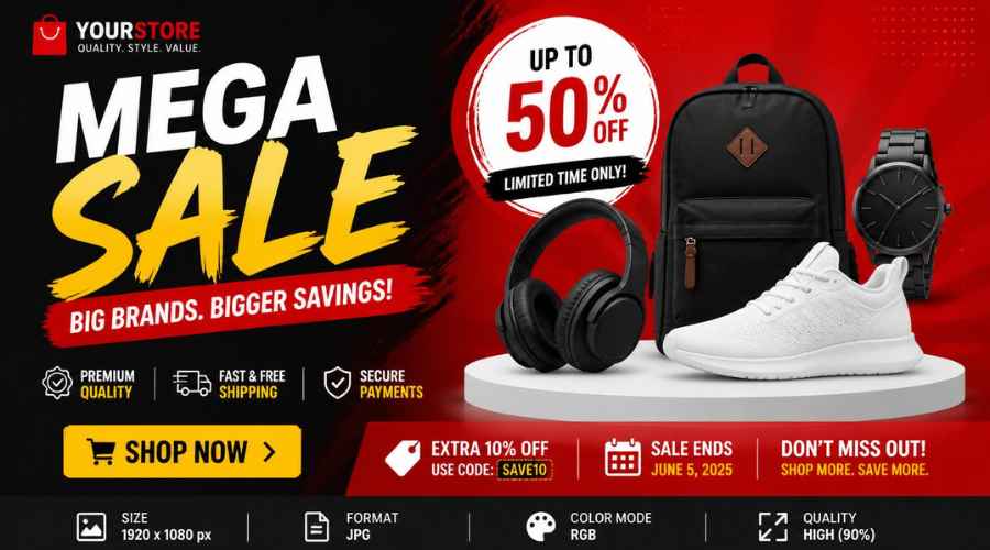
A website sale banner is a graphic used to promote a discount, launch, seasonal campaign or limited-time offer. It usually appears near the top of a homepage, product page, landing page or email campaign.
Step 1: Choose the Banner Size
Website banner sizes vary depending on your layout. Common starting sizes include 1200 x 400 pixels, 1600 x 500 pixels or 1920 x 600 pixels for large hero banners.
If your website uses a specific banner area, check that size first. Otherwise, create a wide design with the important content in the middle so it can crop safely on smaller screens.
Step 2: Decide the Main Offer
A sale banner should communicate the offer fast. Examples include:
- “30% Off This Weekend”
- “Spring Sale Now Live”
- “Buy One, Get One Free”
- “New Collection Launch”
- “Limited-Time Deal”
The discount or main offer should be the largest text on the banner.
Step 3: Add Product or Lifestyle Images
If you sell physical products, use one or two strong product images. If you sell a service or digital product, use a screenshot, mockup, icon or background image that shows the result.
You can also create a related product promo graphic for social media using the same images and colors.
Step 4: Keep the Layout Simple
A sale banner should not look like a crowded flyer. Use one main headline, one supporting line and one call to action.
- Main headline: sale or offer
- Supporting line: date, product category or benefit
- CTA: “Shop Now”, “Get Deal” or “Learn More”
Step 5: Use Contrast for Clicks
Make sure the offer stands out from the background. Use bold colors, a solid text box, a badge or a dark overlay on top of a photo.
The call-to-action button can be a simple rounded rectangle with short text. It does not have to be a real clickable button inside the image, but it should visually guide the user.
Step 6: Check Mobile Cropping
Many website banners are cropped on mobile. Keep the main offer, product and CTA near the center. Avoid placing important text at the far left or right edge.
Step 7: Export for Your Website
Export as JPG for photo-heavy banners or PNG for sharp graphics and text. Compress the image if needed so your website does not load slowly.
Common Sale Banner Mistakes
- Making the banner too crowded
- Using vague offer text
- Hiding the CTA
- Using tiny discount text
- Forgetting mobile cropping
Related Design Guides
Once you have created your website sale banner, you can use the same skills to make other graphics:
Conclusion
You do not need Photoshop or advanced design experience to create a clean website sale banner. Start with the right canvas size, choose one clear message, use readable text, keep the layout simple and export your final design as a JPG or PNG.
Templates, stock photos, uploads, layers, effects and AI backgrounds can all speed up the process. The more you reuse a consistent style, the faster your graphics will look polished and recognizable.
Ready to design your own? open the Canvix editor, choose your canvas size and start creating online.
